Report, edit, etc...Posted by Jinx(j) on 2005-06-12 at 05:17:14
i'm makin a new map on the installation tileset. these are some screenshots from it. ill make another post in the production forum tomorrow. feedback please!
[attachmentid=10292]
this is the lobby. it's on the first level of the space station.
[attachmentid=10291]
this is the galley. Its a restaurant/bar on the space station.
[attachmentid=10294]
this is a generic hallway. there's a hall like this on levels 2-4.
[attachmentid=10293]
this is the ventilation shaft. these things are useful for sneaking around, hehe.
of course there are more screenshots, but i dont want to give you guys everything! hopefully this whets your appetite a bit..
Report, edit, etc...Posted by Clokr_ on 2005-06-12 at 06:10:09
Wow, that trees look awesome. Great idea and good job 
Report, edit, etc...Posted by Wilhelm on 2005-06-12 at 07:05:16
The trees are a really cool idea. I thought of making a city in Installation a while back. Well, that's a great way to make those trees that plant in the sidewalk.
Report, edit, etc...Posted by LethaL on 2005-06-12 at 09:36:24
Excellent. I don't know what it is, but your sprite usage makes it have a cool feel to it. I love it.
Report, edit, etc...Posted by Snipe on 2005-06-12 at 11:14:29
Wow i don't know much about that map but those screen shots seem pritty nice. Wow. I hope that map goes good for you.
*good job
*good job
Report, edit, etc...Posted by KrAzY on 2005-06-12 at 11:37:03
Nice trees, but somehow I think the restaurents are taken...
Report, edit, etc...Posted by Chronophobia on 2005-06-12 at 13:35:26
Yeah I like the trees too, but anyways I think it's too sprite intensive in some ways, like on the second picture... Without sprites it would have been normal terrain, but you did a great work with the sprites!
Report, edit, etc...Posted by BeeR_KeG on 2005-06-12 at 13:50:13
Excellent use of sprites. They add up to the theme of the location.
Not many sprites but you can defiantly see that you are more into the ambient than other maps.
Hall of Famer!
Not many sprites but you can defiantly see that you are more into the ambient than other maps.
Hall of Famer!
Report, edit, etc...Posted by Jinx(j) on 2005-06-12 at 14:48:11
thanks, everyone. dont worry, i wont run out of sprites. this map is 256 x 12! i tried to squeeze as much terrain as i could out of each 20x12 screen.
Report, edit, etc...Posted by KrAzY on 2005-06-12 at 15:20:24
QUOTE(BeeR_KeG @ Jun 12 2005, 10:50 AM)
Excellent use of sprites. They add up to the theme of the location.
Not many sprites but you can defiantly see that you are more into the ambient than other maps.
Hall of Famer!
[right][snapback]233490[/snapback][/right]
Not many sprites but you can defiantly see that you are more into the ambient than other maps.
Hall of Famer!
[right][snapback]233490[/snapback][/right]
I thought you're a DLDB keeper, not a forum, shoutbox, tutorial and game keepers.
Report, edit, etc...Posted by Xeno on 2005-06-12 at 15:30:12
Wow, I like everything! But actually, I think the ventilation shaft could use a little work.
Report, edit, etc...Posted by KaboomHahahein on 2005-06-12 at 16:13:11
They are all very well done. The ventilation shaft was nothing that special, even though it was still pretty good.
BeeR_KeG started the terrain hall of fame thing so he is incharge of it. That is why he decides who's terrain is good enough to get in it. Plus he is also Global Moderator with access to the DLDB.
BeeR_KeG started the terrain hall of fame thing so he is incharge of it. That is why he decides who's terrain is good enough to get in it. Plus he is also Global Moderator with access to the DLDB.
Report, edit, etc...Posted by glytchur on 2005-06-12 at 20:12:12
i think the first picture should be the hall of famer, the picure thats going into the hall of fame is cool, but what are the broken fans supposed to be?
Report, edit, etc...Posted by Rantent on 2005-06-12 at 20:54:13
Although I've seen all of this stuff on earlier maps, this one seems to have a nice feel to it. I like the first pict over the second one though, simply because the second is almost exactly like kamikaze.kows resteraunt. The first one was more original. My favorite out of them was the first, but I think that you could make the last picture into some sort of propulsion engine room and make it great.  Overall these do have quite the feel of a space station hotel.
Overall these do have quite the feel of a space station hotel.Report, edit, etc...Posted by TRiGGaMaSTa on 2005-06-12 at 20:59:34
Wow, i never knew how cool the fans look wihtout their fan sprite. Good effect for a space station window. It looks alot like a window and you can see out into space.
Report, edit, etc...Posted by Jinx(j) on 2005-06-12 at 21:04:14
yup, triggamasta is right. the broken fan is supposed to be a window. glad you guys like this stuff... just wait until you see the rest! there are 7 more rooms in the actual map.
Report, edit, etc...Posted by Xeno on 2005-06-13 at 00:04:44
Now that I think about it the first screenshot reminded me of the park from Aliens. If you've seen the special edition you know what I'm talking about.

Report, edit, etc...Posted by TRiGGaMaSTa on 2005-06-13 at 18:31:30
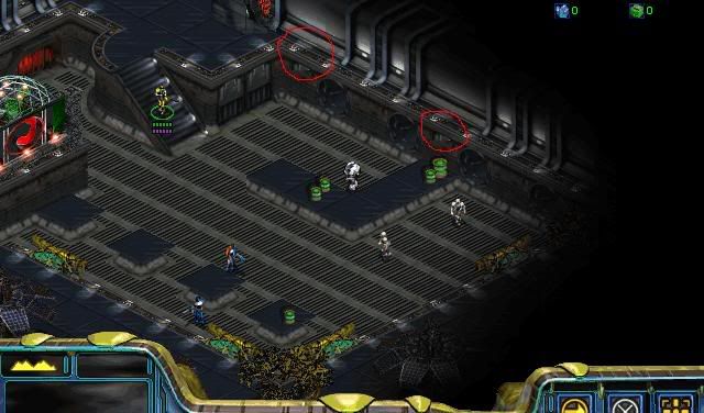
That is the only thing i see wrong in this. You should fix it before it goes in the hall of famer since it's easily fixable and it's only a wrong tile piece.
Report, edit, etc...Posted by Jinx(j) on 2005-06-13 at 19:32:23
yea, thanks i just fixed it. should i upload again?
Report, edit, etc...Posted by Snipe on 2005-06-13 at 20:02:56
Go nuts Whats your percentage done on the Map?
ADDITION:
That is the only thing i see wrong in this. You should fix it before it goes in the hall of famer since it's easily fixable and it's only a wrong tile piece.
[right][snapback]234429[/snapback][/right]
i dont' see it
ADDITION:
QUOTE(TRiGGaMaSTa @ Jun 13 2005, 04:31 PM)
That is the only thing i see wrong in this. You should fix it before it goes in the hall of famer since it's easily fixable and it's only a wrong tile piece.
[right][snapback]234429[/snapback][/right]
i dont' see it
Report, edit, etc...Posted by Rantent on 2005-06-13 at 20:21:17
You need to develop the keen eyes of a terrainer. 
Not to mention the minor detail of adding the very tip of the counter.
Unless that was intentional.
Not to mention the minor detail of adding the very tip of the counter.
Unless that was intentional.
Report, edit, etc...Posted by Snipe on 2005-06-13 at 20:28:28
I see so your not going to explain whats wrong.. lol.
* n/m i see the lights aren't on.
* n/m i see the lights aren't on.
Report, edit, etc...Posted by pimpinelephant on 2005-06-13 at 21:03:23
looks great and nice idea. keep on rolling!
Report, edit, etc...Posted by Kamikaze.Kow on 2005-06-14 at 12:20:50
I like the screens you show, has a good feel.
Although, I think there might be a problem with the ventalation shaft if you need to "Crawl around" in them.. it looks too tight to squeeze through..
Anyway, Good job, hope the map turns out good!
Although, I think there might be a problem with the ventalation shaft if you need to "Crawl around" in them.. it looks too tight to squeeze through..
Anyway, Good job, hope the map turns out good!
Report, edit, etc...Posted by (U)Bolt_Head on 2005-06-14 at 19:19:13
QUOTE(Snipe @ Jun 13 2005, 07:02 PM)
Go nuts Whats your percentage done on the Map?
ADDITION:
i dont' see it
[right][snapback]234515[/snapback][/right]
ADDITION:
i dont' see it
[right][snapback]234515[/snapback][/right]
Look at the one without the circles drawn on it (easyer to see).
There is a blocky corner along the the lower part.